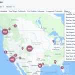
When elected officials talk about changing our immigration system, just who and where are people affected? That’s the question Esri is trying to help answer with a new interactive story map that explores communities with the highest shares of non-citizen residents and DACA recipients.
Using data from ACS and other sources, this tabbed story map illustrates the percentage of non-citizen foreign-born residents in each state, county, and city, along with information about sanctuary areas. The map also visualizes this data at the tract level, so you can understand which specific communities within a larger area may be most impacted by changes to the immigration system. Lastly, the map uses data from USC to show which congressional districts have the largest number of DACA recipients, as well as the estimated economic impact lost if those workers are removed.

